
Visitors to data.wegowise.com can interact with graphics to reveal how incremental changes can drastically affect utility bills. For example, if the 50 percent least efficient apartments became as efficient as the top 50 percent, multifamily buildings in Massachusetts could save 914 million gallons of water each month.
WegoWise was created to advance the building efficiency field by helping people understand and act on their utility data. It uses engaging visualizations to highlight opportunities that drive down usage and costs. Data.wegowise.com builds on top of this expertise to demonstrate more macro-level trends. It allows the public to see how we can leverage millions of meter readings to better understand, and thus improve, the efficiency of the built environment.”
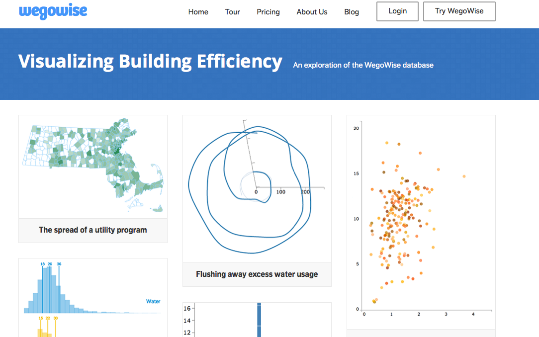
Data.wegowise.com will be updated on a regular basis with additional visualizations and new data. It is being launched with five visualizations:
• Flushing away excess water usage: plotting water bills after a typical retrofit illustrates ongoing savings
• A flock of buildings: exploring tenant comfort by graphing the seasonal swings between gas and electricity use
• Potential water savings: contextualizing water savings with comparisons to a range of buildings
• New England bill breakdown: tracking New England utility bills as they shift over the course of the year
• State showdown: California vs. Massachusetts, comparing monthly utility bills
